The 6 Worst Colors To Paint Your Kitchen

A kitchen remodel can upgrade your entire home and reinvigorate a love of cooking. There are a number of aspects to consider, namely accent pieces, appliances, size, exposure to sunlight, and, importantly, color. Usually, neutral shades reign, but some people love to incorporate bright colors into their house, including the kitchen, as a fun way to jazz up their living space. While this can work beautifully in small bursts, painting the whole room one solid bright color can be a risk. Darker colors absorb more light and can make the space appear smaller than it is. Some bold colors may actually be too overstimulating to comfortably stay in the kitchen for long periods of time.
You can (sometimes) paint kitchen countertops as well as walls, so you have the option to create a cohesive look that will tie the whole space together. Ultimately, your personal style will lead the way, and you should feel excited to walk into the kitchen every day, but do take into consideration some practical tips before you take the plunge.
Red
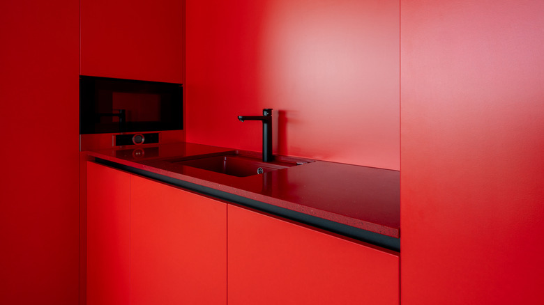
When done correctly, red can give your kitchen an old school diner vibe and is definitely a retro kitchen design we want to make a comeback. However, this is an entire aesthetic that needs to be carefully crafted. Simply painting everything bright red and doubling down on appliances will be extremely stimulating and may come to strain the eyes.
Neons
Neon colors are notoriously hard to work with, kind of by nature. Their purpose is to stand out from a more muted background given their brighter appearance. If you apply these colors too broadly, they don't lose their vividness; it simply expands to whatever space they're filling. In a nutshell, like red, it can be too much of a good thing and quickly become overwhelming.
Yellow
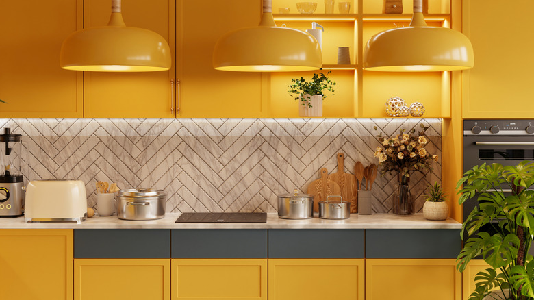
Yellow kitchens were trendy in the 1950s and 1960s, and are starting to see a revival — albeit in brighter shades. But trends are fickle and fleeting, and designs that were once cool are quickly outdated. Truthfully, any shade of yellow can grow stale and give off a vintage appearance, but not in a good way. A bit here and there can add some sunshine to a kitchen; the whole kitchen will make things look dated, and fast.
Black
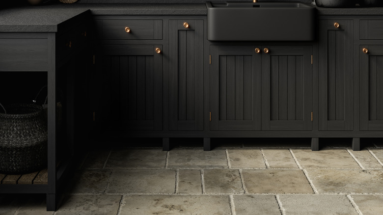
If you are looking for a way to create a moody atmosphere in your kitchen, think first before jumping to turn everything black. It may be a bold aesthetic, but it's very hard to work with practically. Black absorbs light, so even with lots of overhead lighting, it will be hard to see what you're doing clearly.
Beige
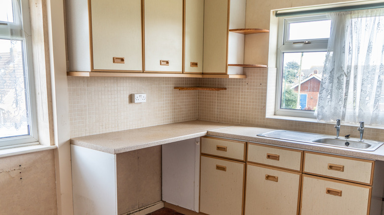
Neutrals are safe and often visually appealing, but an all-beige kitchen might take this too far. What can start as a calming space may become overwhelmingly bland, leading people to not feel a pull toward the kitchen. Beige is also a flat color, and too much can cause a lack of visual depth, making it uncomfortable to work in. If you need to add depth to your kitchen, one way to do so is by using a dedicated alcove for your stove.
Pink
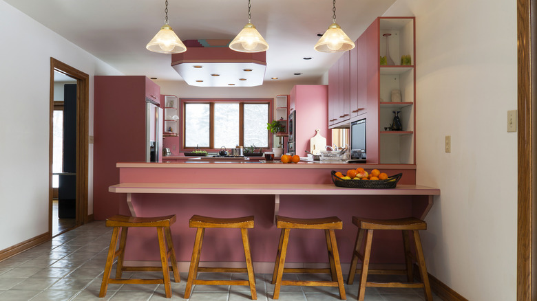
Pink accent pieces, like a creative backsplash, can transform a kitchen into a fun workspace, but too much can make things feel very one-note and overwhelming. Additionally, there are various shades of pink available, but it can be difficult to coordinate hues appropriately. Ultimately, pink is an overwhelming color for the whole room that, unfortunately, looks more trendy than timeless.