The Property Brothers' Ideal Cabinet Color Scheme For Your Kitchen

Identical twins Jonathan and Drew Scott, professionally known as the Property Brothers, have long been go-to sources for what's hot and what's not in home design. Over the years, the brothers have been quick to steer their fans away from trendy kitchen features they aren't fond of, advocating for better, longer-wearing options that are more conducive to creating long-term value instead.
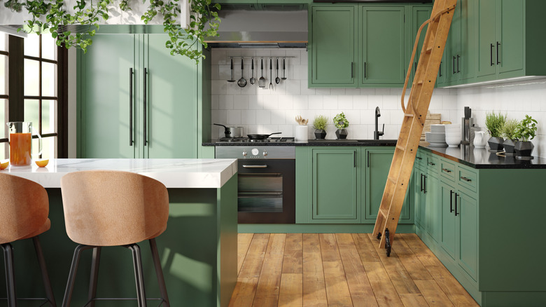
The brothers have very definite opinions about kitchen finishes. For instance, they feel laminate countertops should be avoided in favor of higher-quality, more durable materials. They similarly have a strong recommendation when it comes to choosing your kitchen cabinet color scheme. On their website, the style-savvy siblings suggest ditching the millennial all-white kitchen in favor of bold, dark, and colorful cabinetry.
The pair especially favor greens and blues for cabinetry. However, when designing your space, remember that color should ultimately reflect your personal taste rather than fleeting trends. In the much-used kitchen area of the home, chosen colors and finishes should help create a custom-tailored gathering space you enjoy spending time in.
Though it can be intimidating to commit to the boldness of color on something as permanent as cabinetry, the Property Brothers advise that making dark cabinets work well is a matter of balance. For instance, contrasting the deep hue of darker cabinets with a light-colored backsplash and countertop creates a harmonious look. Light- or medium-toned flooring is also a great complement to darker cabinetry, and abundant natural light further acts as a contrasting element that brings out a dark cabinet's undertones.
The benefits of darker cabinetry
There are various benefits to choosing a darker-hued cabinetry scheme for your kitchen. The addition of a deeper color can add character and create a pleasing level of visual depth and interest, as opposed to a more monochromatic approach.
An added advantage is that color better conceals the wear and dirt that inevitably build up over time. This is particularly helpful for lower cabinetry, which is in the "hot zone" of kitchen activity and is, therefore, more susceptible to becoming dirty and sustaining damage from impacts. On white cabinets, handprints, stains, chipping, and other imperfections show up starkly, requiring much more cleaning and maintenance.
When incorporating colored cabinetry, the two-toned approach is a popular choice. This style adds color to either the upper or lower cabinets, but not both — one set gets a darker tone, while the other receives a lighter, contrasting color. If you want to apply this in your kitchen, it's generally best to go with a darker hue on your lower cabinets and make the uppers lighter. This not only gives the higher-traffic set of cabinets a more damage-concealing color, but it also helps add visual balance. The darker color provides an anchor that's visually grounding, while the lighter shade draws the eye upward and helps visually open up the space.