The Neutral Backsplash Color That's Nearly A Thing Of The Past
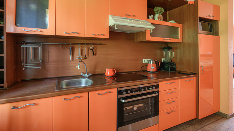
If you walk into a kitchen built 15 to 20 years ago, you'll likely see the design fingerprint of the era — dark, dramatic backsplashes in shades of brown. At the time, those rich tones conveyed sophistication, but a decade later, they read very differently. Food Republic reached out to an expert in the field, Terri Brien, principal designer and owner of Terri Brien Interiors to shed some light on the topic. "Brown backsplashes were everywhere around the early to mid-2010s," she notes. "Think Emperador Dark brown marble, lots of warm chocolates, sometimes paired with multi-colored glass and stone mosaics." For a while, these rich shades projected sophistication, but as design preferences shifted, their presence became a liability.
"Over time, homeowners and designers started wanting a more light and airy feel of openness in their kitchens," Brien explains exclusively to Food Republic. "High-contrast backsplashes started feeling heavy, visually closing in spaces rather than expanding them." That desire for openness coincided with a broader move toward minimalism, cleaner lines, and lighter palettes. Trends tracked by the National Kitchen & Bath Association support this shift, noting a clear preference for whites and soft neutrals in recent years.
According to Brien, "The move toward whites, grays, softer tones was really the pendulum swinging back, visually lightening homes, making kitchens feel cleaner and more modern." What was once a defining feature is now a retro kitchen design that feels like a relic of a bygone era.
How to use brown today without dating a kitchen
Even though brown has fallen from its peak, Terri Brien says it isn't completely off the table: "Brown still works in certain contexts, especially if it's done with intention and care to what it is being paired with." Instead of busy mosaics, she recommends elevating the look with a single material. "A beautiful full height slab splash in a brown stone with warm veining can feel luxurious rather than dated," Brien shares exclusively with Food Republic. Adding ledges or styled shelves can also make darker tones feel lighter and more modern.
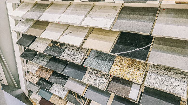
Context is critical, as Brien emphasizes that "it's also more fitting in homes where there's contrast with lighter cabinetry or lighter walls so the brown doesn't feel overwhelming." For homeowners curious about staying with warm tones, she points to stones like "Brown Suede marble, Fantasy Brown marble, Bronze Fantasy, or Velvet Taupe limestone." Each offers variation and richness that keep the look updated.
Practical updates can help, too. "Also updating hardware, changing lighting fixtures, or removing visual clutter around the backsplash area help update the look," Brien suggests. Lighting plays a particularly important role, as LED under-cabinet lighting can significantly change how darker surfaces are perceived. Through pairing brown with thoughtful materials and strong lighting, this dated hue can still feel at home in a contemporary kitchen.
Neutrals are dominating
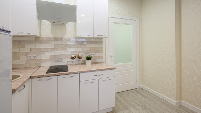
For kitchens being remodeled today, lighter tones dominate. Terri Brien notes, "Neutrals trending now are soft whites, light taupe, beige, and cream tones. Think colors that reflect natural light rather than absorbing it." Trends have also evolved so that "materials like Moroccan zellige tile in warm whites or beiges, slab splashes in marble or quartzite with soft veins, sealed plaster or limewash style splashes" are becoming increasingly common.
Brien ties that popularity to lifestyle changes. "With open-floor plans, less division between kitchen, living, and dining, the backsplash no longer gets trapped behind cabinetry or small lighting," she tells Food Republic exclusively. It seems that with the way our expert breaks it down, in some cases, even those old-school lighting trends won't work to brighten up the room if you select certain shades of brown that you can't really use to complement your space. And sometimes, people just don't want to work that hard to ensure their space is inviting.
"Also neutral tones allow more flexibility: It's easier to change accent colors later with accessories rather than having to replace large features," she adds. That adaptability reflects how people live today — in spaces that feel bright and in unison, with the freedom to swap in seasonal or personal touches. In that environment, darker browns rarely find a natural fit, which is why it's a vintage kitchen decor trend that might not make a comeback.