Burger King's Logo Is Designed To Make You Crave Fast Food — Here's How
When you grab food at a restaurant, the decor may be one of the last things on your mind. But did you know the design of an eatery — particularly fast-food establishments — is often strategically crafted to stimulate appetite and prompt you to buy more food? The same goes for the logos used by popular restaurant chains. To you, the consumer, the words "Burger King" sandwiched between two clipart buns is likely just a clever piece of iconography that was whimsically chosen to represent a brand. But there's nothing random about the design approach that leads to the emblems of large fast-food chains.
For more insight into this, Food Republic spoke with Zachary Rischitelli, owner of Real FiG Advertising + Marketing. Rischitelli explained how big food brands leverage its imaging to net larger profits and entice consumers to buy (and eat) more each time they stop in. "Red and yellow are often used in fast food branding for a reason," he shared. According to the expert, color has a powerful effect on customers' psyche. "Red is associated with energy, excitement, and, in particular, with an increase in appetite. Marketers rely on it to stimulate faster, impulsive decisions. Yellow is used to evoke a feeling of happiness and joy, attract attention, and create a positive emotional perception of the brand."
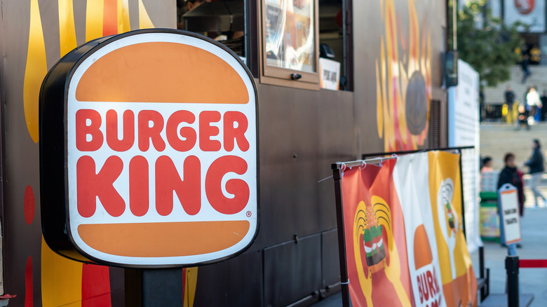
The two eye-catching colors together creates a stimulating image that hungry consumers can't help but look twice at. Employing red lettering with yellow-orange colored buns above and below its name, Burger King's iconic logo is a perfect example of this strategy used to great effect.
Burger King's logo is more than just a clever image
The enticing color scheme is not the only facet of BK's logo that has been strategically designed to prompt purchases and promote brand loyalty. According to Zachary Rischitelli, "The shape of a logo is just as important to how a brand is perceived as the colors."
The conscious mind tends to notice color first, closely followed by shapes. Since Burger King's logo looks like a hamburger, it immediately communicates a message that helps stimulate hunger. The lettering and buns used in BK's emblem are both very curved, which also makes an impression when consumers see it. "Rounded, soft shapes create associations with comfort and accessibility, and if a brand uses such shapes, it feels more friendly and attractive to the audience," Rischitelli explained. Burger King's large, bold font also plays a critical role. With the logo's soft shapes conveying convenience, the confident typeface brings home the overall effect, prompting would-be diners to cruise in and grab some of their favorite quick-bite goodies. These are just tricks of the trade, like how free restaurant bread tricks your brain.
Burger King is among fast-food chains that are now completely different from when they first opened, except for its logo. The retro imaging harks back to similar emblems the company used in the 1960s and '90s, also featuring the restaurant's name between two buns. It seems the chain's branding has been effective. BK has been going strong since 1954, outliving other brands with less effective marketing, including a "Burger Queen" nemesis that was once competition.


