The Classic Novel That Inspired Starbucks' Iconic Name
Starbucks has been doling out an array of whole bean and ground coffees and specialty beverages since 1971 when the company opened its first shop in Seattle. Today, it has grown to more than 35,000 locations, with the company name now synonymous with tasty lattes, frosty Frappuccinos, and those signature holiday cups. Though, the name Starbucks actually has nothing to do with coffee at all. Instead, its origins were inspired by a rather unlikely source: Herman Melville's classic book, "Moby Dick."
Hailed as Melville's magnum opus, the 1851 novel describes the epic journey of the Pequod, a fictional whaling vessel helmed by a crazed captain hellbent on destroying a white sperm whale who bit off his leg. At first glance, the story bears no resemblance to the now-famous coffee brand; however, as the company explains on its website, it does evoke "the seafaring tradition of the early coffee traders" who battled the ocean's waves in ships to deliver coffee beans to Europe and beyond.
Starbucks and its origins with the sea
In addition to paying homage to seagoing coffee traders, Starbucks' founders — Gerald Baldwin, Gordon Bowker, and Zev Siegl — were also drawn to the sea because of the port city of Seattle's position on the Puget Sound where, even today, coffee still arrives via cargo ship. But, they also wanted the company's name to entice a sense of adventure while staying true to its roots in the Pacific Northwest. Bowker was a writer, so naturally, he favored Pequod, the name of the whaling ship in Herman Melville's book. Not everyone was on board, however, so back to square one they went.
In a 2008 interview with The Seattle Times, Bowker revealed the trio almost settled on the name "Cargo House" — which, he said, would've been a mistake — but the artist they were working with at the time, Terry Heckler, had something else in mind. While researching Seattle's rugged Mount Rainier — the tallest mountain in Washington state and the Cascade Range in general — in the hopes of finding a suitable mining camp name that could work for the coffee brand, he stumbled upon "Starbo." This led the team back to the pages of "Moby Dick" once more, landing on the name of the Pequod's chief mate: Starbuck. And the rest, as they say, is history.
Starbucks' logo has had several makeovers
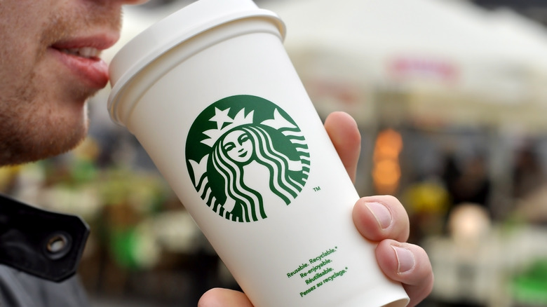
Today, Starbucks' logo is, perhaps, just as recognizable as its name. It features a green mythological creature known in Greek mythology as a siren, which resembles a mermaid but with two tails. Similar to the brand's name, the company drew inspiration for its logo from the sea, picking the nautical figure from an old marine book. But, the Starbucks logo of today hasn't always looked the same and has undergone several changes over the years.
Originally brown in hue with the words "Starbucks Coffee Tea Spices" attached to it, the logo was changed to a green color pattern in 1987, dropping "Tea" and "Spices" altogether. In addition to the new modern feel, the siren was also made to appear more modest. The logo got another update in 1992, zooming in more on the siren's upper half to show less of her tails.
However, Starbucks' biggest change came years later in 2011. Although the siren's signature crown remained, the coffee giant dropped its iconic name "Starbucks Coffee" from the logo, which drew mixed reactions from diehard fans. Regardless, the coffee giant is as popular as ever, perhaps even more so now thanks to its dedication to continual innovative growth, as seen by its swanky Starbucks Reserve locations and its iconic seasonal twists on classic coffee drinks.