
Why Fast Food Logos Often Have These 2 Colors
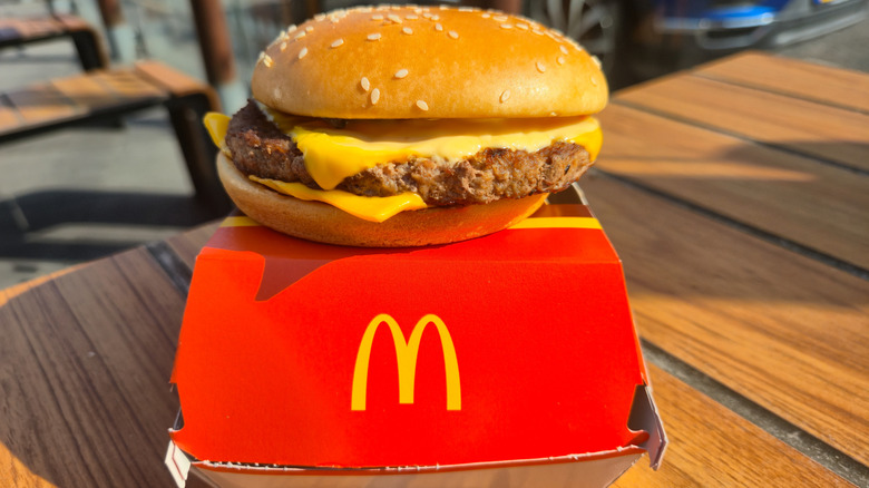
Fast food chains seemingly do the most to get people into their restaurants. When McDonald's started hearing from angry customers that its prices were getting too high, it lowered the cost of eight of its combo meals as part of a concerted effort to woo people back to its drive-thrus. Burger King's mascot has evolved continuously since the 1950s, encompassing everything from a Duke of Doubt to kid-friendly monsters and a Creepy plastic King. But one thing these two burger chains have in common, with many other fast food conglomerates, is their use of red and yellow in their logos. It's not an accident; both colors actually stimulate something in consumers' psyches.
The color red actually speeds up people's heart rates, the same as when we're excited about something. Viewing it can give people a sense of energy and even passion, creating an urgent need (for a cheeseburger!). Yellow also has positive associations, like happiness, but it's also capable of emitting comfortable vibes, like the yellow rays of the sun warming you all over.
It's no surprise then that so many logo creators have combined the two colors to give potential customers the subtle notion that if they act on their urgent boost of excitement, they will find joy and contentment in what they order. It's a bit of psychological brain hacking, but there's a reason marketing falls under the sciences.
Green is gaining on red and yellow
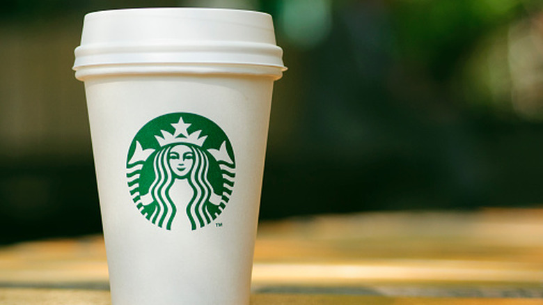
Of course, not every fast food chain uses red and yellow, or they do and incorporate other colors into their logos in order to differentiate themselves from the sea of ketchup-and-mustard-hued branding. A choice that is becoming more popular is green, which, like red and yellow, sends a subtle, though entirely different, message to consumers. Green is thought to represent a healthful, natural choice (what could be more nourishing than the color of so many plants?), as well as one that is kind to the environment; the phrase "Go green" comes to mind when thinking about earth-friendly actions made marketable. It can also signify abundance and luxuriousness.
Starbucks is the obvious leader in green branding where fast food is concerned. Would it surprise you to learn that the coffee chain's original logo was actually brown (it also almost had a different name, as well)? It shifted to green in the late 1980s as part of a brand refresh, and the transition couldn't have suited the company better. Now, Starbucks' logo color suggests to the world that the coffee beans used in its drinks are grown naturally and sustainably, and imbibing from any cup that has the green siren on its side has certainly come to reflect a certain status for the drinker.