This Breakfast Chain Has Had The Same Logo Since The '60s
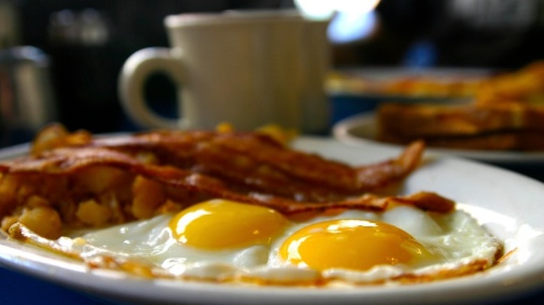
Americans love breakfast food, not even exclusively in the morning. Subsequently, a myriad of chains offer such comforting fare; even McDonald's once had a breakfast buffet. Yet among such competition, few eateries take on a cherished status quite like Waffle House. Famed for no-frills but tasty Southern-style breakfast dishes served day and night, it's a restaurant with a pleasantly lost-in-time aura.
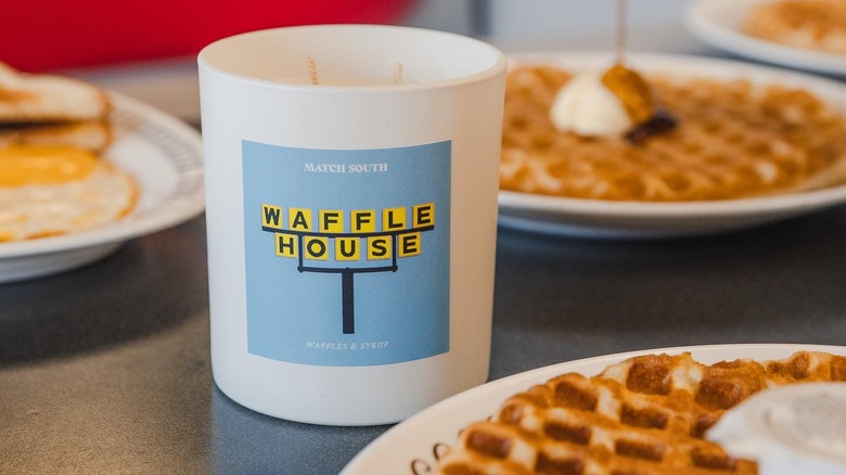
To no small extent, such nostalgic affiliations can be attributed to the chain's branding. For decades, the restaurant's iconic yellow sign and bold, square-encased lettering have attracted customers. While other large chains periodically change up logo designs, Waffle House has impressively employed its aesthetic logo since 1969, 14 years after its founding. In addition to storefronts, the memorable lettering appears on menus, advertisements and unique branded products (the chain once released board games!).
An intentional form of marketing, the iconic design was created by a friend of a Waffle House co-founder. Originally, the chain employed a design consisting of oozing golden letters seemingly written in syrup (a logo that continued on the chain's plates for some time). The rework created a more direct and impressionable look that still carries an upbeat aesthetic. It's such simple yet thoughtful charm that has built a chain that sells billions of eggs a year and draws a devoted following.
Waffle House purposefully retains historic qualities
Waffle House's origins trace back to 1955, when two neighbors, Tom Forkner and Joe Rogers Sr., opened a relaxed, community-focused eatery with round-the-clock operation. With an intentional focus on inclusivity, considerations in food, design and service led to the chain's beloved status. As the business proliferated during the 1960s and '70s, Waffle House maintained a rigid consumer-oriented strategy outlined in an extensive operations pamphlet. Today, those values are still reflected in unwritten Waffle House rules covering both decorum and ways of ordering.
Amid this development, Waffle House translated its welcoming ethos into design as well. From the early days, stainless steel furnishings emerged as a marker of hygiene, while counters established social ease. Then, the seventh outlet, opened in 1962, initiated the now-widespread real estate template filled with comfortable booth seating.
To this day, Waffle House upholds these timeless design cues, inside and out. Locations are kept small, with instantly recognizable exteriors. Meanwhile, the minimalist yet welcoming interior creates a warm atmosphere long unchanged. All capped off with the vivid yellow logo glimmering into the night, these decades-old markers serve as a beacon for affordable breakfast food, fit for any time of day.


