Why HGTV's Hilary Farr Says You Should Rethink This Popular Kitchen Color Trend

When you're undertaking a renovation, the old adage about having too much of a good thing definitely holds true when it comes to color. There are colors you should just outright avoid in your kitchen, and there are also some paint colors that work well. Additionally, even with the right colors, one can simply have too much of them, which, according to HGTV star Hilary Farr, is a design mistake that needs to be avoided.
From informing us on how to choose backsplashes and countertops like a pro to how one can get the most out of a remodel, Farr is an authoritative voice of guidance in the design world. On her hit renovation shows, she doesn't pull punches when it comes to calling out things she deems to be bad design decisions — and excessive use of color is something that definitely incites her derision. Trends like color drenching and using a lot of boldness with hues are all the rage right now. But Farr prefers a more classic, timeless take.
Color should never be a distraction, she advises. It should fit with the overall design of a space without detracting from it or pulling focus. In other words, color should be the frosting in a design scheme, not the cake. While she's not afraid to be bold with color, Farr favors timelessness and moderation — especially when it comes to paint colors, preferring to bring in boldness with fabrics and other forms of color pops. And, even with colors playing more of an accent role rather than having a starring presence, they should always blend harmoniously with the rest of the design and not seem like an intrusive adornment.
Other color tips from Hilary Farr
Hilary Farr favors using neutral colors and earth tones as the bread and butter of a design. Bold colors can be incorporated via elements that are easily moved and changed out, rather than buying big-ticket items in distinctive hues and having to live with the choice for years to come. For instance, choosing an island that is a clean, neutral color and using things like dishware and décor pieces to provide the desired spots of color is a smarter way to go. It's much cheaper to replace cloth napkins and chair cushions, for instance, than to redo an entire island, install new cabinetry, or buy new appliances or furniture pieces.
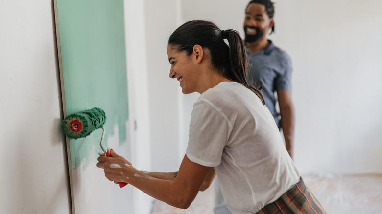
Farr also advises against using vivid paint colors on walls. Going for a neutral wall tone makes a space seem larger. If a homeowner does have a craving to make a bold splash on their walls, though, in that instance, at least, it's easy and inexpensive to make a change once they tire of it. If you are painting, she strongly recommends painting the walls and ceiling the same color.
The design star also counsels amateur designers not to embrace every trend that comes along. There are certain paint colors that are in vogue and abundantly used, for instance, that she personally dislikes. Just because something is trendy doesn't mean it's in good taste for one's living space. After all, the best colors for a cozy kitchen are a matter of personal preference.