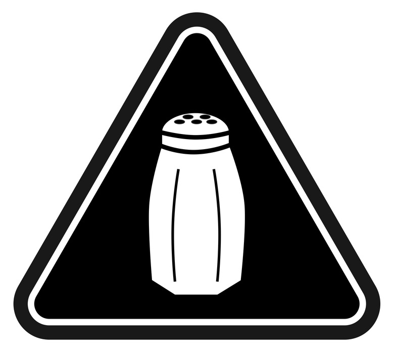
Why I'm Excited About NYC's Salt Warning Labels For Restaurants
If you've ever gone skiing or snowboarding, then you're probably familiar with the ubiquitous black diamond marker. You find this dark-colored geometric logo atop the steepest, most difficult slopes. These are the hills that really get your heart racing. Take a peek over the edge, and you'll probably wish you hadn't. Yet if you have any sense of adventure, you're compelled to take the plunge anyway — even if only to boast about your bravery later.
This is why New York City's new sodium warning labels for restaurants are destined to backfire. The signage, which looks similar to skiing's black diamond, is simply too enticing.
New York is the first city in the nation to require chain restaurants (roughly one-third of all eating establishments citywide) to post salt warnings next to menu items that exceed the federally recommended daily limit. (That's 2,300 milligrams, if you're counting, which sounds like a lot, but really amounts to a single teaspoon.) The National Restaurant Association has challenged the new regulation in court, but a Manhattan judge yesterday ruled in the city's favor, allowing the rule to go into effect on March 1.
Salt, of course, is very controversial: Too much may be harmful to your health; too little is considered a crime against gastronomy. Whatever its negative associations, salt brings out the flavor in foods, making it a powerful element in cooking. If you've ever complained that a dish "needs more salt," well, this new regulation could helpfully eliminate the guesswork at the point of order.
Let's set aside the health and wellness debate for the moment (and allow the lawyers to battle it out on appeal). Instead, let's take a closer look at the iconography.
The city's chosen warning label depicts a salt shaker set against a black triangle, which is geometrically similar to the black diamond. Sure, a three-sided triangle isn't exactly identical to a four-sided diamond. But visually, they're not that different. The logo's blackness is intended to be menacing, but the color's psychological effects are complex. Black is also a symbol of power, and in ancient Egypt, it represented life and rebirth. And who hasn't felt more alive after skiing down a steep hill, or even gulping down a reviving bowl of briny broth?
Meanwhile, the placement of these salty triangle logos next to individually listed dishes recalls another common graphic on restaurant menus: the spicy chili pepper logo. Like with salt, the pepper image is meant as a warning, advising faint-hearted diners that this particular dish may not be to their liking. But for more adventurous eaters unafraid of spice, it conveys the opposite message: Eat me, you'll enjoy it. Likewise, the salt logo may encourage flavor seekers, not dissuade them.
All three of these logos (the black diamond, the salt shaker, the chili pepper) are advertising essentially the same thing — excitement ahead.
Just remember: In dining, as in skiing, when you take the plunge, you do so at your own risk.


