Counter Culture Coffee Revamps Its Packaging Design In A Splashy Way
It's pretty hard to stand out among the crowded coffee landscape these days, but Counter Culture Coffee just got our attention. The North Carolina-based third wave coffee roaster is debuting a fresh new packaging concept this week, along with newly named roasts to compliment the dramatically changed looks.
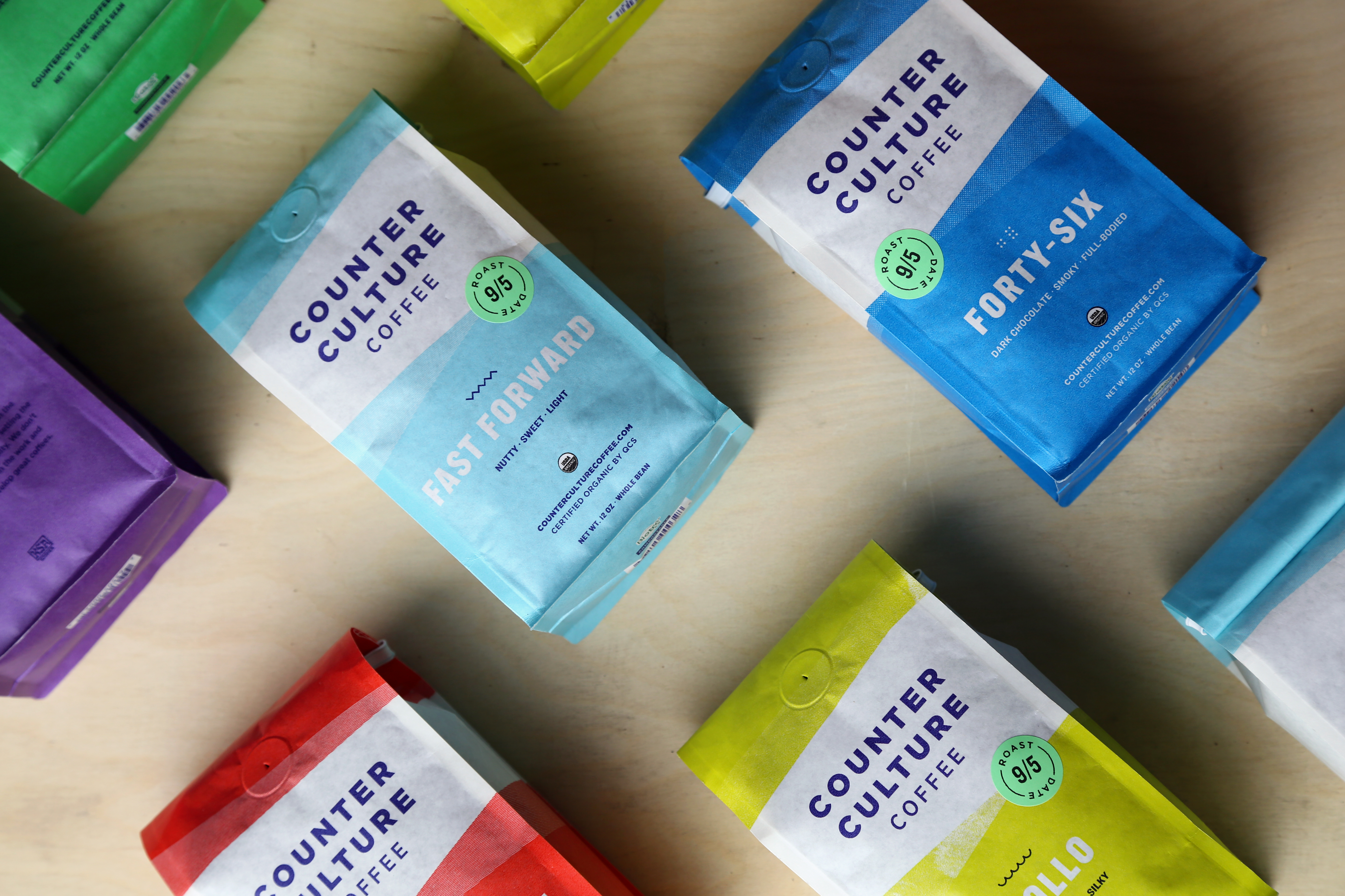
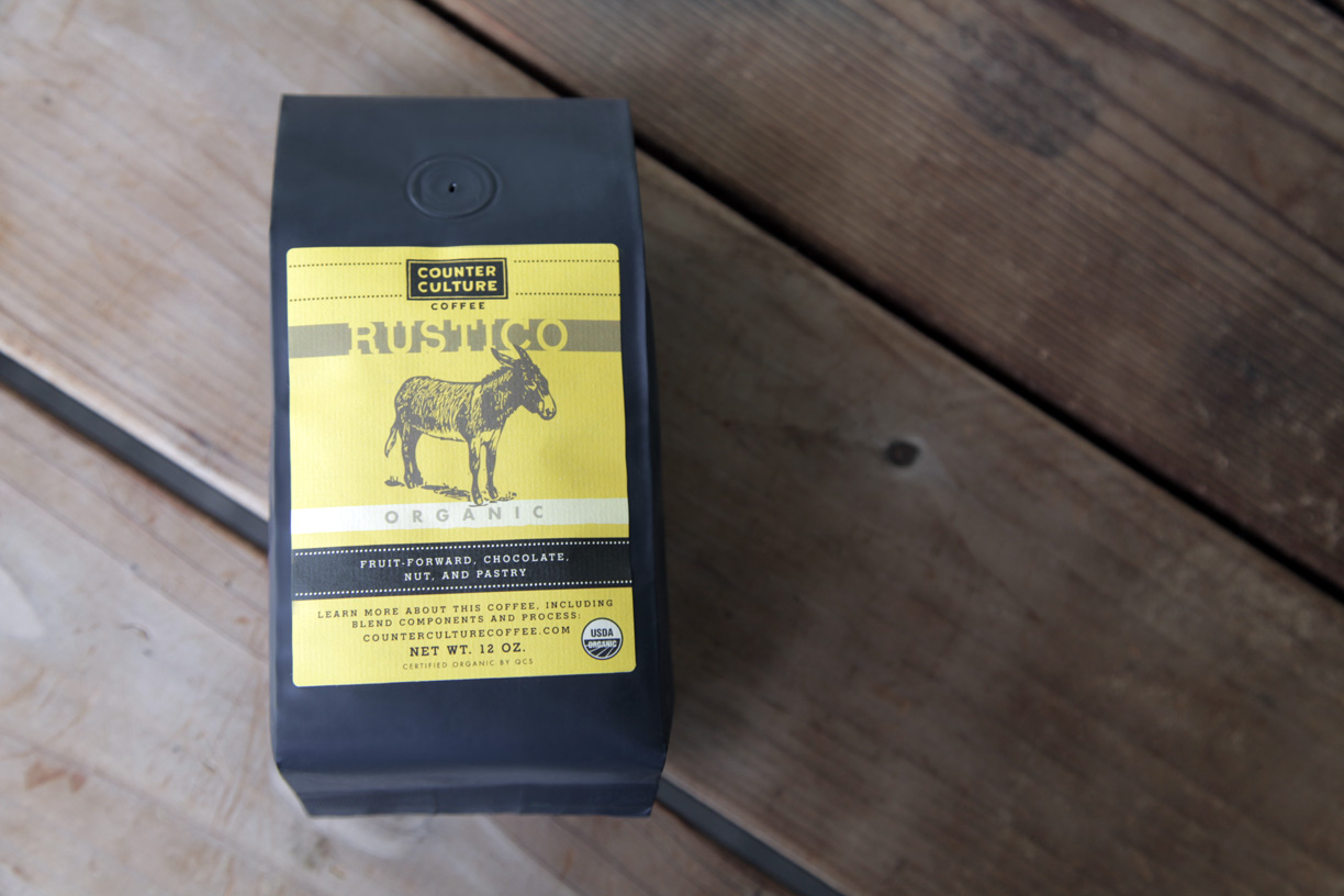
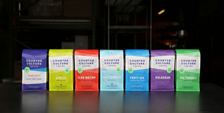
Gone are the basic black and brown bags with their spare sticker labels and down-home names like "Rustico" and "Farmhouse," which have been replaced with biodegradable bags in vibrant colors, each showing slight detail variations according to the roast, with names like "Hologram," "Big Trouble," and "Fast Forward" to match. According to the brand's president Brett Smith, the naming process included filters and buzzwords such as "modern, American, and with a sense of humor." "We approached it from the perspective of the coffees: what they taste like, what we're trying to do with them," Smith says. "Along those lines, Hologram (formerly Rustico) captures the spirit of the coffee: complex, dynamic, light, and vibrant."
It's a risky move to change a brand's outwardly familiar characteristics all at once, but this one pays off, both by the looks and the sounds of it.
 As third wave coffee brands like Counter Culture, La Colombe, Stumptown and others are well on their way to carving out larger shares of the market, a packaging upgrade proves that design is just as high-priority as the quality product inside.[/caption]
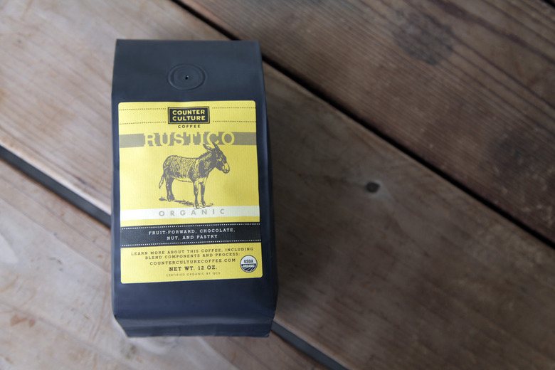
 Counter Culture Coffee's Rustico roast (above), newly packaged and renamed as Hologram (below), will debut with the rest of the brand's revamped lineup this week.[/caption]


