For Domino's Pizza, Black And White Is The New Red, White And Blue
Those of us who are spoiled by all the excellent artisanal pizza options out there might never consider picking up the phone and ordering a pie from a generic chain, but Domino's slick new packaging for its recently launched pan pizza program is at least worth a glance.
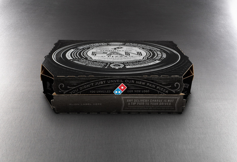
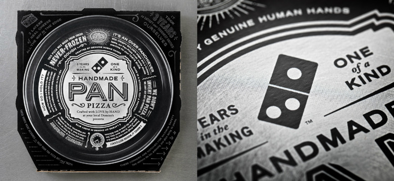
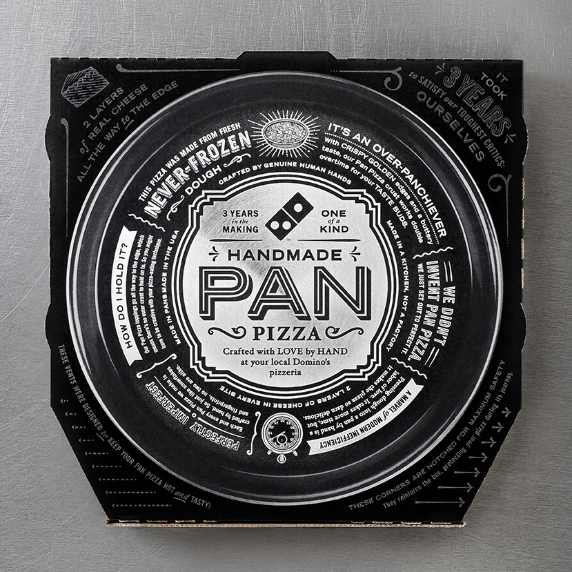
Besides the chain's trademark logo (and the contents, of course), the packaging eschews traditional pie box coloring, instead displaying a notably more badass black and metallic silver combo. The ad and digital agency CP+B conceptualized the entire look, with its purpose being one driven by authenticity: most pan pie doughs are frozen, whereas Domino's uses only fresh product. (CP+B is the latest iteration of the mega-agency Crispin Porter, which gave the world various viral Burger King ads.)
Cleverly (and carefully, we're sure) worded facts and info about the dough's freshness adorn the outside of the box, adding to the new pie's niche as a more "premium" menu item — hence justifying its slightly higher pricing than competitors like Pizza Hut and Papa John's. We've yet to conduct any taste tests — in fact, we'd rather encourage you to make your own pies — but we'll happily dispense points for style. See the photos below...
 The new box is the work of the ad and digital agency CP+B.[/caption]
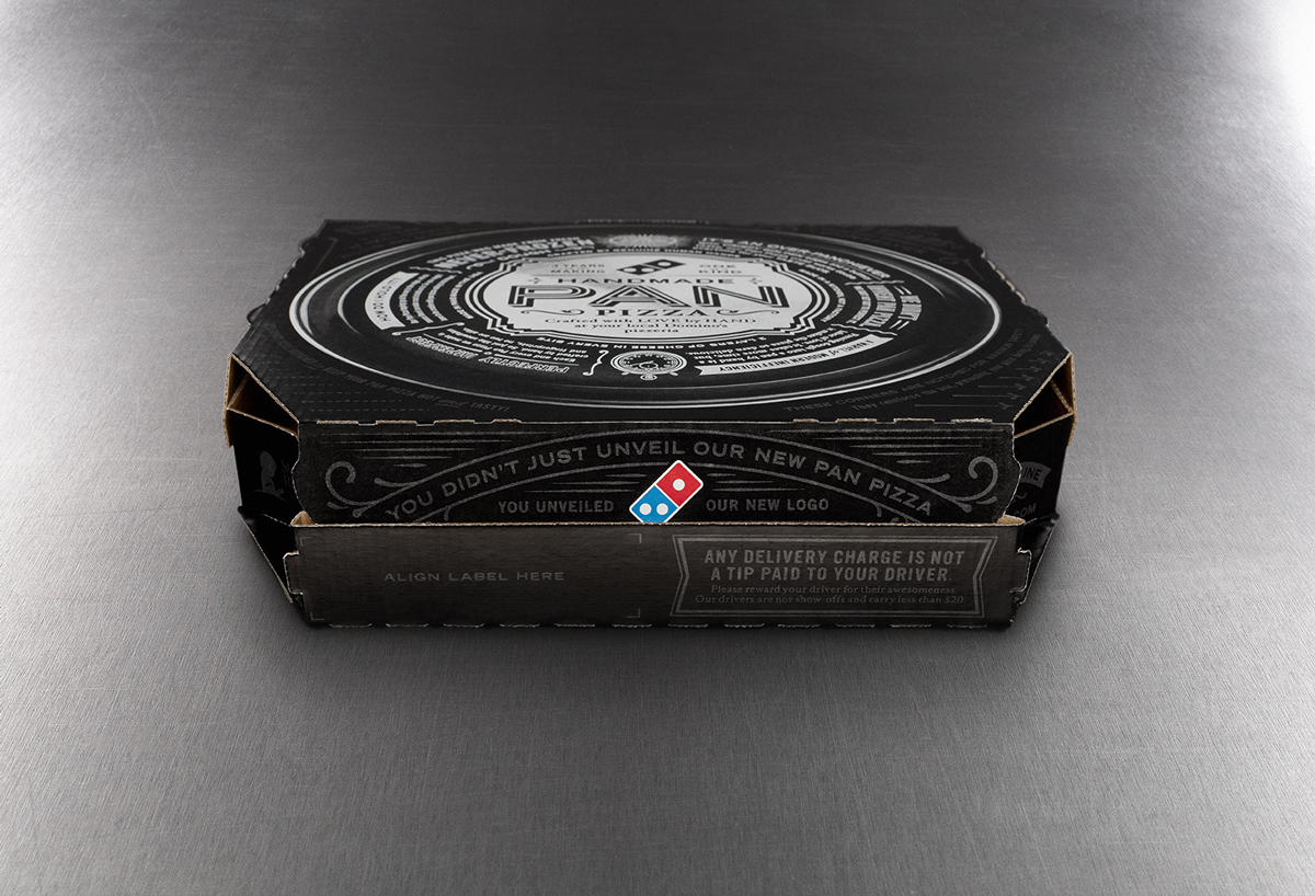 Domino's obviously couldn't resist sneaking its familiar logo somewhere on the box.[/caption]