Seagram's, Redesigned

It's been a while since we considered buying one particular label's ginger ale simply because it looks so much cooler than the rest of what's on the beverage aisle shelf, but that may change with the new Seagram's cans. Thanks in no small part to its stellar rebranding and new look by the San Francisco-based firm Hatch.
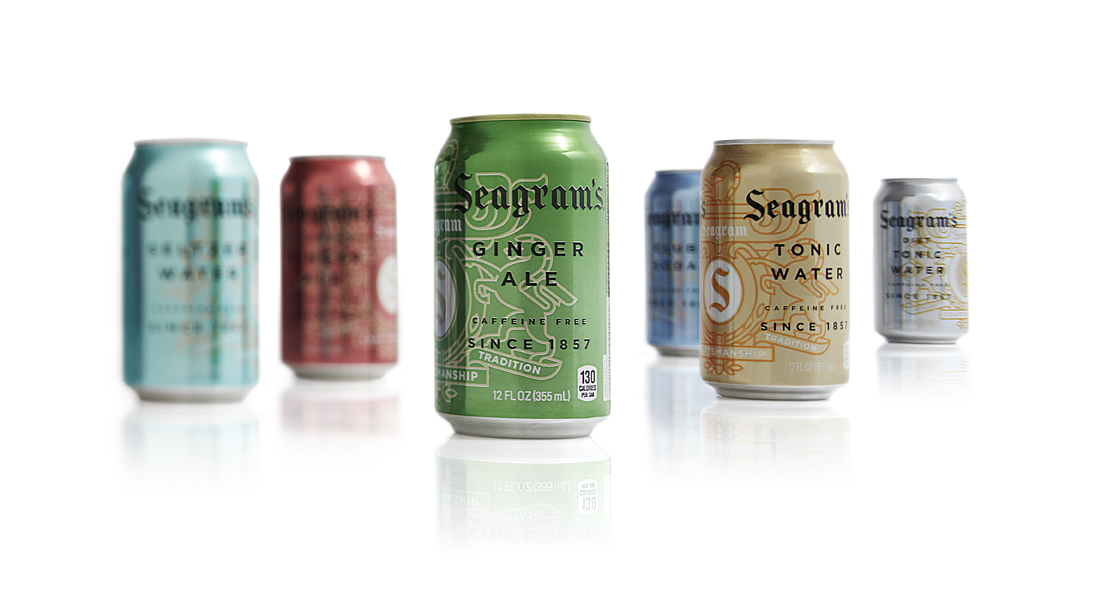
A transformative new design can have those kinds of hypnotizing effects, but when you're also dealing with a brand as iconic and long-established as Seagram's, the results could be equally off-putting. That no doubt speaks to the success of such an undertaking: the look is fresh and incredibly smart, while maintaining the 155-year-old brand's most recognizable characteristics.
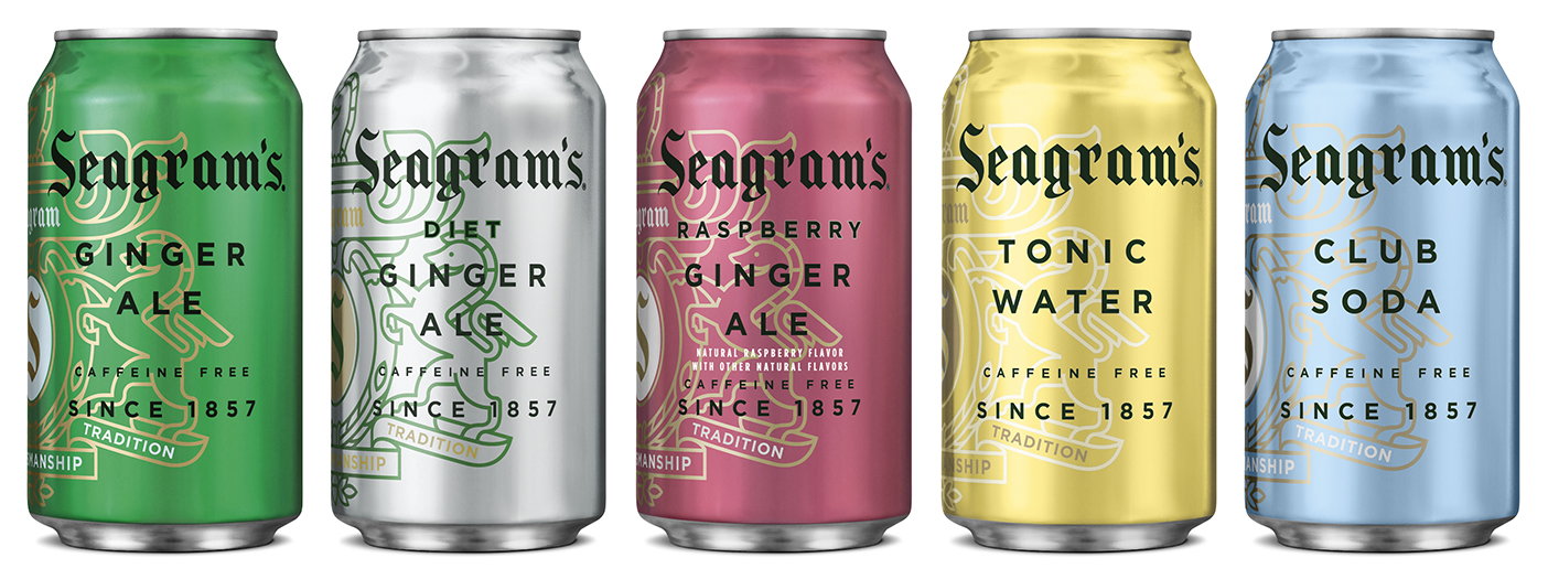
The redesigned lineup of Seagram's carbonated beverages, including ginger ale (green), tonic water (yellow) and club soda (blue).
Hatch's co-founder Katie Jain explains to Food Republic that she and her team chose sophisticated metallic shades of the colors that consumers already associate with the different flavors, category-wide, which raised an interesting question about this class of beverage branding in general: why is it that green is the color most commonly used for ginger ale; yellow for tonic water; and blue for club soda?
Historically, that just seems to have almost always been the case, at least with regards to ginger ale, a trend begun by Seagram's, and followed by Schweppes in the late 1800's, and eventually Canada Dry at the start of the next century. Just as this most recent project within Seagram's lineup challenged its developers to create a new look that remained emblematic of its past iterations, so the story goes amongst its competitors to create looks that were different from each other, yet also reminiscent. But at least for now, there should be no mistaking Seagram's for its rivals.