Eye On The Prize: Farmshop's First-Class Appeal

As we wrap up our coverage of this year's James Beard Award nominees in the design categories, LA's Farmshop, nominated for its original graphic work, deserves some serious props for being the only West Coast establishment to get a nod this year.
Located in the Brentwood Country Mart, the upscale eatery takes the familiar market to table-driven notions beyond familiar territory. Below, Clive Piercy of Air Conditioned, the studio behind the design and creative direction at several south Cali fixtures, including Roxy and the buzzy burger destination Father's Office, tells us how he kept things fresh.
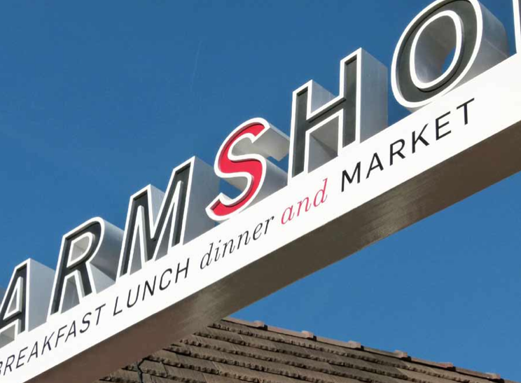
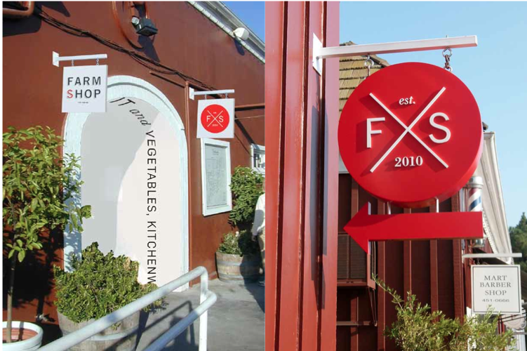
Farmshop's signage: The direction was to find a design that alluded to the past, "but not look retro," says designer Clive Piercy.
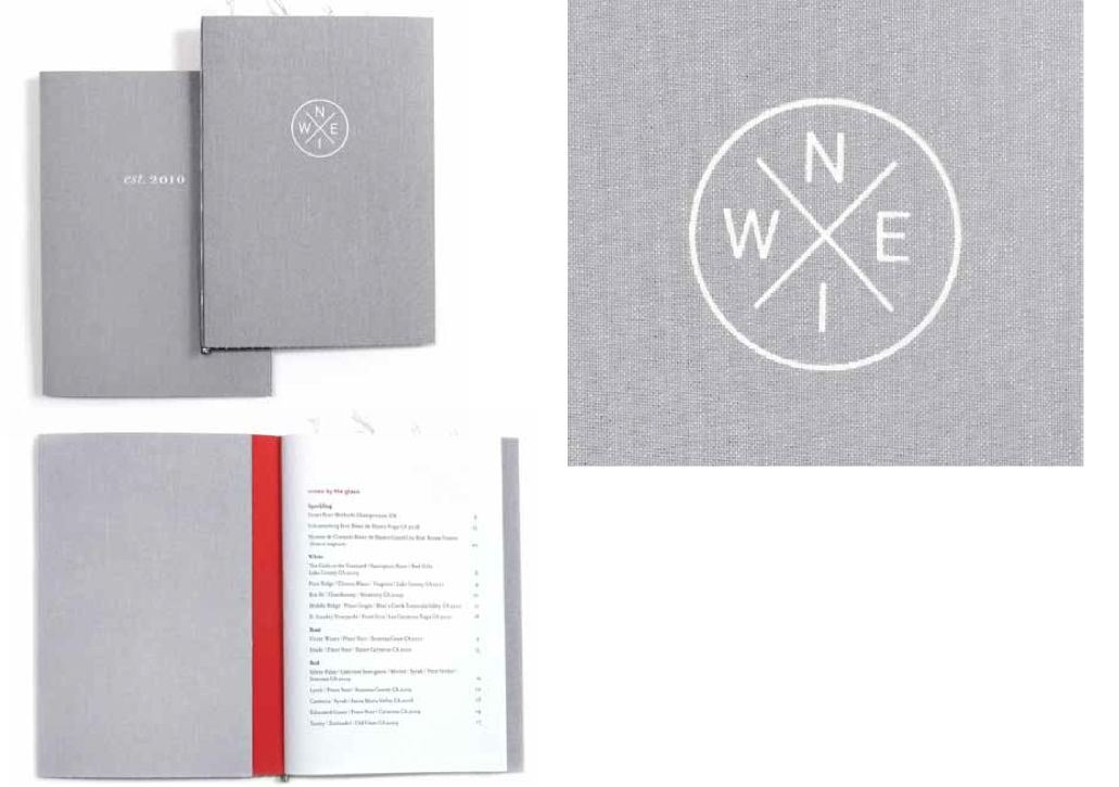
The restaurant's wine list adds an elegant touch to counterbalance the casual daytime menus.
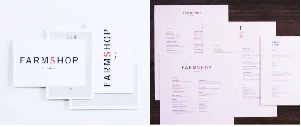
Menus for breakfast, lunch and dinner.
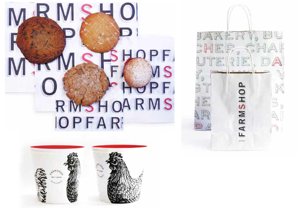
Labels and packaging for takeaway items and goods from the eatery's artisan market.
When you're working on any project of this sort, what are some of the first few questions you ask yourself?
Does the client want something good? Does the client get us? Are they decent people? Can we bring something good to the table? Is it a nice table? Can we have influence beyond the simple discipline of graphic design.
What were some of the major ideas or aesthetic themes that the owners wanted to come across in Farmshop's branding and graphic design?
We all agreed that it should look upscale, but not intimidating. Stuffy... never! Intentional. That it could allude to the past, but not look retro. I didn't want to come up with a logo that is then plastered onto every available surface in exactly the same cookie-cutter way. The aim is to supply a visual kit of parts that, when utilized properly, rewards the visitor by its freshness the more times they come. And because they are open from early morning until late in the evening, I wanted the menus to gradually become more elegant as the day wore on.
How did location, both the interior design and the neighborhood, inform the kind of image you wanted to create with this project?
The Brentwood Country Mart is a much-loved institution in this neighborhood—"neighborhood" being a rarely used term in Los Angeles. From the late '40s it has attracted a loyal, star-studded clientele, from Cary Grant and Shirley Temple—not as an ITEM—to Jennifer Garner and Reese Witherspoon. The owner of the BCM, Jim Rosenfield, very carefully "curates" the Mart and the magic is in the mix. Everyone knew that Farmshop would be the tenant that would bring the whole community together.
Were there any challenges, unexpected or anticipated, along the way?
Budget, as ever. "Make it look amazing, but we have little money to spend on it."
As a designer, when you go to a restaurant or a bar, what's the first thing that your eye tends to gravitate towards?
The kinds of people who are in there. If everyone is the same age, old or young, I leave. Like any community, which is what a good restaurant should be, the mix is vital. I can't go to a place that has bad graphics. No graphics, fine. Bad design...no thanks. That's why I love Balthazar in NYC. You could see Ed Koch sitting next to Natalia Vodianova—and get to choose oysters from a wonderfully designed menu.