Eye On The Prize: A New New Amsterdam

As we continue our coverage of prize-worthy design and this year's James Beard Awards nominees, Jon Santos, founder of the NYC-based creative firm Common Space Studio, talks to us about the graphic design and branding components he delivered for chef Andrew Carmellini's buzzy Soho eatery, The Dutch. (Yes, the same Carmellini who took over our Instagram account this past weekend.)
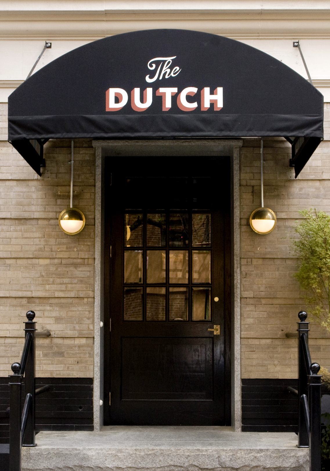
Santos, who also teaches in the Communications Design department at the Pratt Institute, faced the challenge of illustrating the Dutch's neo-American regional cooking, offered in a classic New York setting that feels like it's been around for years. No small task, given such varied ingredients, but the final product, a simple and stylized glance back towards WPA-era signage, certainly fit the bill. Read the Q&A below the photos...
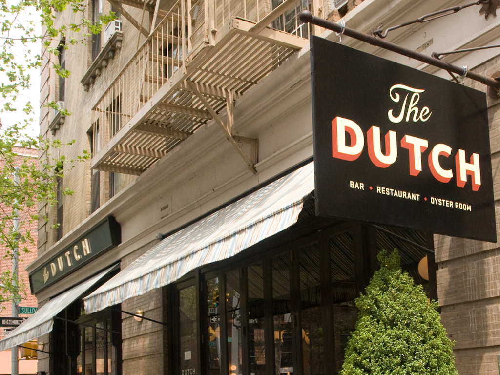
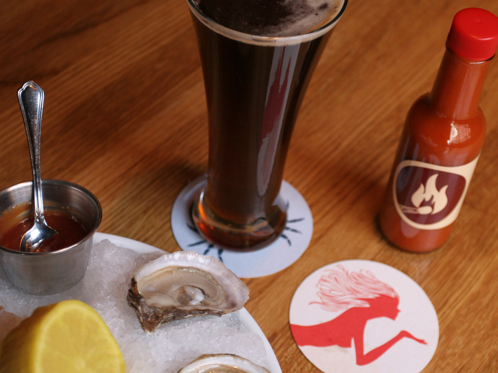
For graphic designer Jon Santos, the design project was a fully comprehensive one, encompassing outside signage to match the Dutch's handheld components: menus, matchbooks, cards and more.
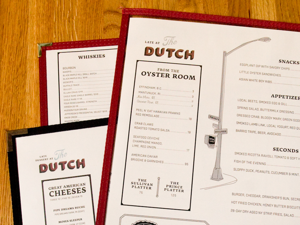
The restaurant's menus
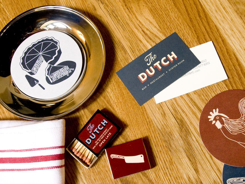
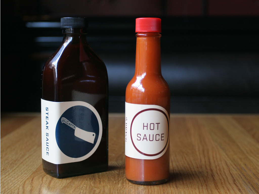
Dutch-branded condiments bearing simple iconography
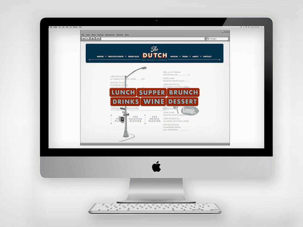
Santos's branding extends to The Dutch website
When you're working on a restaurant or hospitality project, what are some of the first few questions you ask yourself?
What makes this place interesting? Who are the regulars? What is the story?
What were some of the major ideas or aesthetic themes that the owners wanted to come across in the restaurant's branding and graphic design?
A.C. [chef/owner Andrew Carmellini] was talking about the menu and these homegrown dishes from different parts of the U.S. I thought of it as regional American food—though I don't think he would use those words. He talked about NYC-style signage: the everyday, somewhat nostalgic butcher and deli storefronts that have a sort of graphic naiveté. I was interested in the WPA posters and their bold, stylized, illustrative and striking, invigorating qualities.
Any clichés you wanted to avoid?
We definitely talked about not throwing in any wooden shoes or windmills.
Did location—both the building and the neighborhood—have an effect on the kind of image you wanted to create?
It did in a lot of ways. I was pretty close to getting a stylized illustration of a cleaver painted onto a blade sign to hang on the Sullivan Street side—with no text! But it got ruled out, as we thought it was leaning a bit much on a Gangs of New York/Five Points aesthetic.
Were there any challenges, unexpected or anticipated, along the way?
At some point I remember there being eight people in various meetings: half from Roman & Williams, the firm behind the interior design, and half from the restaurant. A lot of cooks in the kitchen! A lot of really creative voices in the mix, but we ended up with something that we were all pretty happy with in the end.
When you go out to a restaurant or a bar for your own enjoyment, what's the first thing that your eye tends to gravitate towards?
The guests, of course!
Read last week's look at another Beard nominee for DBGB.