Can A Retro Logo Disguise One Wimpy Beer?
These days there's no shortage of soft drinks and other liquid refreshments targeted for the calorie-conscious — think about all the beverages with "zero" in their names. Light beer is no different, though typically (unanimously?) frowned upon with a reputation for not measuring up to its fully loaded counterpart. Drinking light beer sometimes makes people question your, well, your gonads.
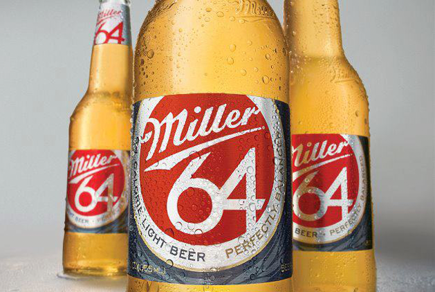
So this begs the question: Do you really have to put your manhood aside in order to follow a more health-conscious lifestyle? The newly-launched redesign of the Miller64 line by the Chicago-based design firm Soulsight possibly answers the bell with a less-obvious label and packaging. But is it enough to diminish the connotations of a wimpy drink?
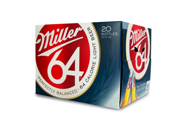
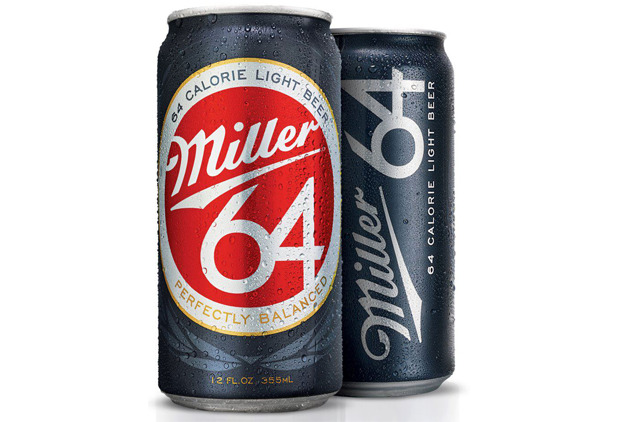
In the case of Miller64, the number 64 shows prominently on cans and bottles in a retro style that might call to mind the year 1964 as much as the number of calories per serving — while "light" appears more discreetly in the logo. Whether or not this pulls fuller-bodied ale drinkers over to the light side is yet to be seen, but the updated look is a smart one that doesn't betray the product.

Branding firm Soulsight's recent redesign of Miller64 light beer.

The "Light" label is hidden.

A post-workout case anyone?

