The Secret Code In Starbucks Apron Colors
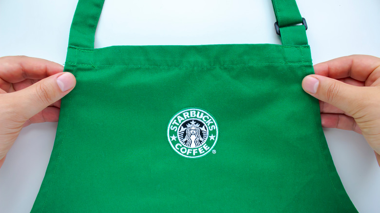
Even if you don't give Starbucks apron colors much thought, you might have noticed that employees sometimes wear different colors besides the classic green. For the most part, Starbucks employees wear green aprons with the company logo, a tradition started in 1987. However, they may exchange their green aprons for red ones around the holiday season, and there are even more colors that have different meanings.
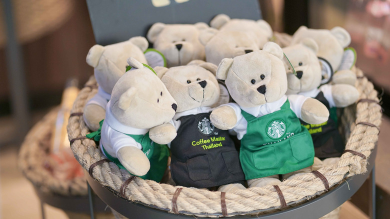
If you see a Starbucks employee with a black apron, that means that they are an expert in coffee. Black aprons are awarded to employees who attend the Starbucks Coffee Academy to expand their coffee knowledge and further their skills. Students in this educational program learn about sourcing Starbucks coffee and the ethics involved; how coffee is grown and harvested; and even how to roast and blend the perfect cup of coffee.
Employees of Starbucks Reserve and Roastery locations have their own special apron design as well: tan aprons made of sturdy canvas and leather straps. These aprons only add to the elegant craft of coffee-making showcased in Starbucks' more upscale locations. Customers in cities like Seattle (Starbucks' home base), Chicago, Tokyo, Milan, and more can head to these special locations to get a look at how different the surroundings — including the employees — look from the norm.
Starbucks aprons have evolved over the decades
Although Starbucks employees first donned the green aprons in 1987, the company itself was founded in 1971. At this time, employees wore the dark brown aprons similar to those worn by grocers, and it was just a happy coincidence that the shade matched the coffee beans they were grinding each day. They later switched to green aprons (simultaneously updating the logo from brown to green as well) paired with crisp white shirts, seeking to emulate the staff of Italian coffeehouses.
By 1992, the chain had added its logo to the mass-produced aprons to encourage brand recognition, and shortly thereafter, began offering black aprons to "coffee masters" who graduated from the Starbucks Coffee Academy.
Today, Starbucks aprons come in plenty of additional variations, including a green apron with an embroidered U.S. flag for veterans and their spouses. Starbucks also handed out green aprons with American Sign Language embroidery to its Deaf employees in 2017, with the hopes of easing communication between employees and customers. You might even see aprons in blue or orange during certain promotions, or at certain international locations.
Why did Starbucks choose green?
Whether or not you've taken art, design, or marketing classes, you've likely recognized how certain colors evoke certain feelings. As such, businesses choose their colors very carefully in order to promote a particular vision of what they are. Starbucks, for one, leans heavily into its signature green motif by means of crafting a "fresh and inviting" environment for customers. Green also symbolizes the company's past, present, and future as it moves toward sustainable practices, like its 2024 BYO cup system.
Others have suggested that green also represents Starbucks' fresh start when it changed hands in 1987. After all, this very same year, the aprons and logo also changed from brown to green. More generally speaking, in terms of color language, green is said to represent growth and energy, as well as positivity, warmth, and even motherly protection. All in all, green makes for a calming experience, something we can appreciate when settling down with a cup of coffee.