Stylish Suds: Check Out This Font-Tastic Beer Concept

Chances are, you've never heard of Akzidenz-Grotesk, the century-old typeface font that resembles Helvetica in its simplicity and clean lines. Neither had we — until we saw it emblazoned all over these cool longnecks.
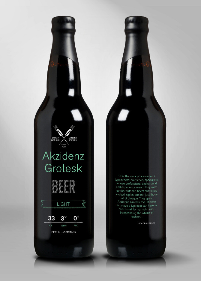
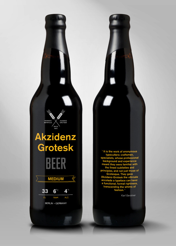
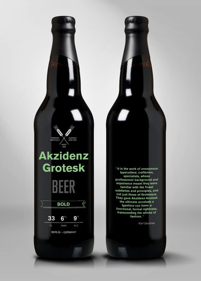
In a conceptual series comprising six beer types, the Lisbon-based designer João Andrade gives us all a reason to raise our glasses (er, bottles) to his favorite font. Since Germany is the third-largest importer of beer, and Akzidenz-Grotesk originated in Berlin where it was used by printers, the marriage of the two seemed both appropriate and appropriately random. In the examples below, each label's typeface varies in weight and width according to the level of alcohol in each beer.
We love the concept — the more innovative and forward-thinking label designs, the better — though we'd probably discourage anyone from actually using the word "grotesk" in a beer name.
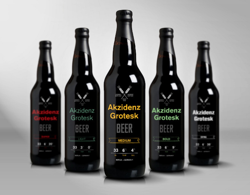 In designer João Andrade's world, Akzidenz-Grotesk beer would exist in five varieties: light, medium, bold, super and extra (shown above). More individual examples below.[/caption]