Caribou Revs Up Its Coffee Cup Design
"Life is more than coffee. That's why there's coffee," goes the tag line for Caribou Coffee's latest ad campaign. It's part of the huge coffee chain's all-out media push, including TV and radio spots along with print ads aimed to drive consumers to its 415 U.S. locations (it's the second-largest coffee chain after Starbucks). but for us, it's the newly designed packaging that speaks loudest.
Design revamp credits go to Minneapolis-based agency Colle+McVoy, which came up with the whimsical collection of disposable cups and napkins emblazoned with smatterings of cool-type logo fonts and homespun graphics.
It's true, life is more than coffee. But with coffee chains stepping up their game to offer products that compete with the pricier independent and third-wave brands, then the packaging should reflect that. Check out some of the new designs below.
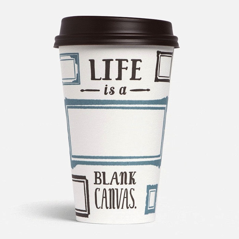
 Conceived by the Minneapolis-based agency, Colle+McVoy, Caribou's clever new packaging takes your basic disposable cup logo-and-font design to a higher level.[/caption]
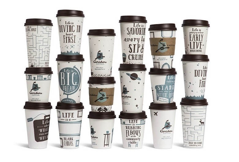
 The full collection of revamped coffee cup designs.[/caption]