New York City: A Designer Gives Sauce Restaurant A Visual Identity
There's been a gut-busting surge of Italian-American red sauce joints to hit New York City in recent years. Frank Prisinzano and his East Village strongholds Frank, Lil' Frankie's and Supper, helped kickstart the trend, albeit with a dedication to providing more than just the cliché of cooking with Grandma's homemade gravy.
When Prisinzano and partner Rob DeFlorio decided to add another restaurant to their stable and opened Sauce last fall, the pair enlisted Marty Weiss, the founder and creative director behind Meter Industries, to help them with the newly expanded concept: a nose-to-tail Italian trattoria with an on-site butcher and grocer.
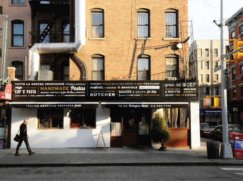
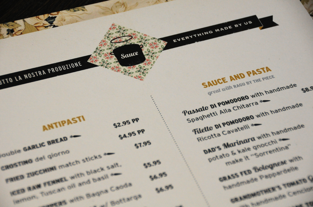
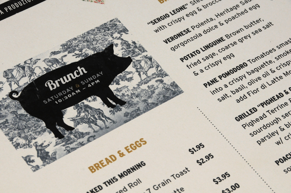
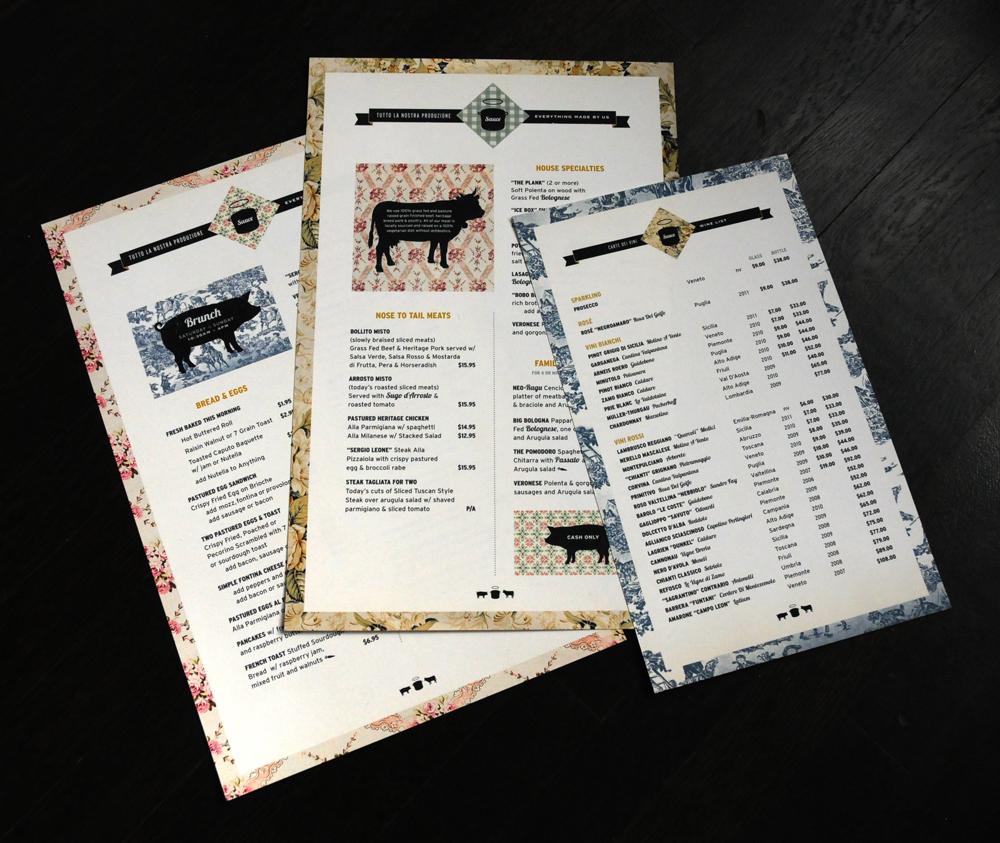
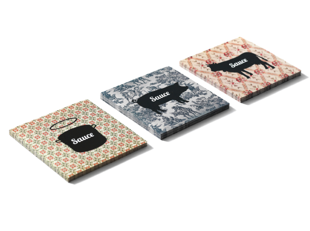
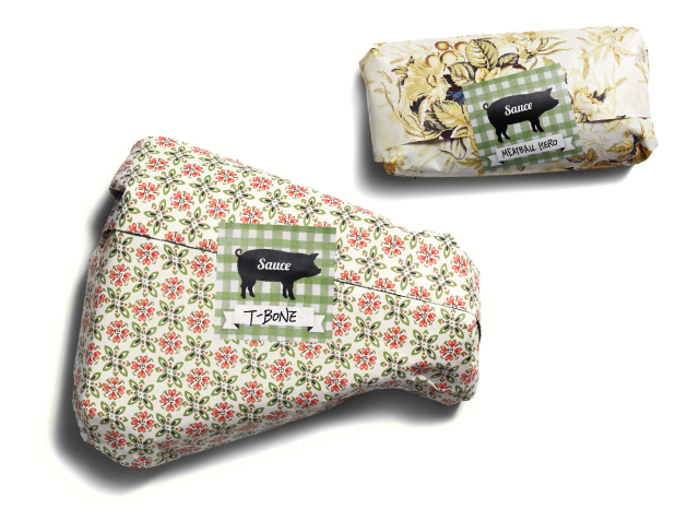
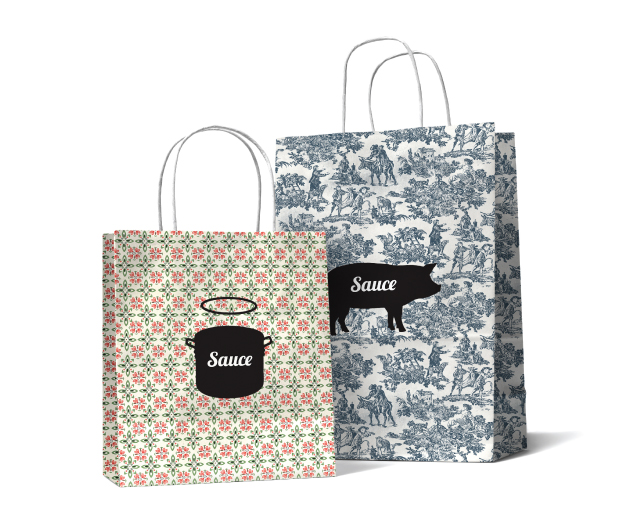
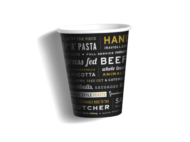
Weiss and his team created a grab bag of whimsical branded items and packaging for Sauce, including wallpaper, coasters, coffee cups, butcher paper and carry-out bags, as well as the exterior signage. The result? There's a lot to look at. Check out a bunch of examples below after this graphic chat with Weiss.
When starting any hospitality-related project, what first tends to run through your mind?
You have to understand the essence of the place and what the vision is. So I wound up spending a lot of time with the owners [of Sauce], Frank Prisinzano and Rob DeFlorio, trying to get their vision. Frank, as I'm sure you know, has three successful East Village restaurants. They've been there for a while, so I was trying to spend time there, trying to get in their heads as much as possible, spending time in the new site, looking at the plans...to understand what they were thinking about, and what the idea of Sauce was all about.
What were some of the directives the owners gave you in the early stages?
There's certain elements that are kind of just part of who Frank is, and his restaurants too. There's a certain kind of un-design design that Frank has in his other places. I think the aesthetic of this place—this was gonna be more about the restaurant. And as you know, there's a butcher. They butcher meat there, they sell it there. There's grocery items.
So your task as designer wasn't just to make it an extension of the other restaurants.
They wanted this to be bigger as a brand that had a lot of pieces and a lot of potential, and ultimately could wind up in stores and extensions of the restaurant. So the graphic identity comes from needing to create this overarching look, this "design language" if you will, that could allow itself to be used in a lot of different places.
Where were you drawing references from?
Part of the influence was for the grocery aspect, and butcher storefront—the storefront signage we did—came from all the old Italian grocery stores. That was an influence. Frank had a lot of grandmotherly wallpaper, but it was kind of a combination of things that got us to the wallpaper...pigs and cows, and the hog with the halo has become our "Nike swoosh" in a way. That's our icon.
Italian-American, red sauce-style restaurants seem all the rage in New York right now. With Sauce, were there any specific clichés you wanted to avoid within that genre?
We don't think so much about what everyone else is doing as much as we're trying to do something that comes out of the personality and vision of Sauce itself. There's certain things about Frank and Rob — there needs to be a bit of humor. There's very much an unpretentious sensibility, and it goes back a bit to their roots. They're Italian-American, having grown up in Queens and Long Island, and their heritage is from Italy, so there's a little bit of that old world mixed with a more modern, humorous, unpretentious kind of wit.
The place has a floral menu, and toile wallpaper and packaging. Was it challenging to bring motifs that could easily be considered too feminine into the mix? Because it doesn't come across as a prissy place at all.
The identity isn't just about one thing. It took on a different kind of feeling than if we'd just had one flower pattern. Because we were using half a dozen things, it had a feeling of being your grandmother's kitchen, but spun in a kind of interesting way.
When you go out to a restaurant for your own enjoyment, what's the first thing to usually catch your eye?
Well, I'm a visceral guy, so to me it's gotta feel good. It's gotta feel inviting. It's gotta feel interesting. There has to be a visceral feeling, like a soul or a heartbeat or something. Clearly it's gotta be a nice experience, and the food's gotta be great, but once I'm there and I've eaten, then looking at the menus, the signage, the graphics — that's sort of like dessert for me.
 (Click here to start slideshow.)[/caption]
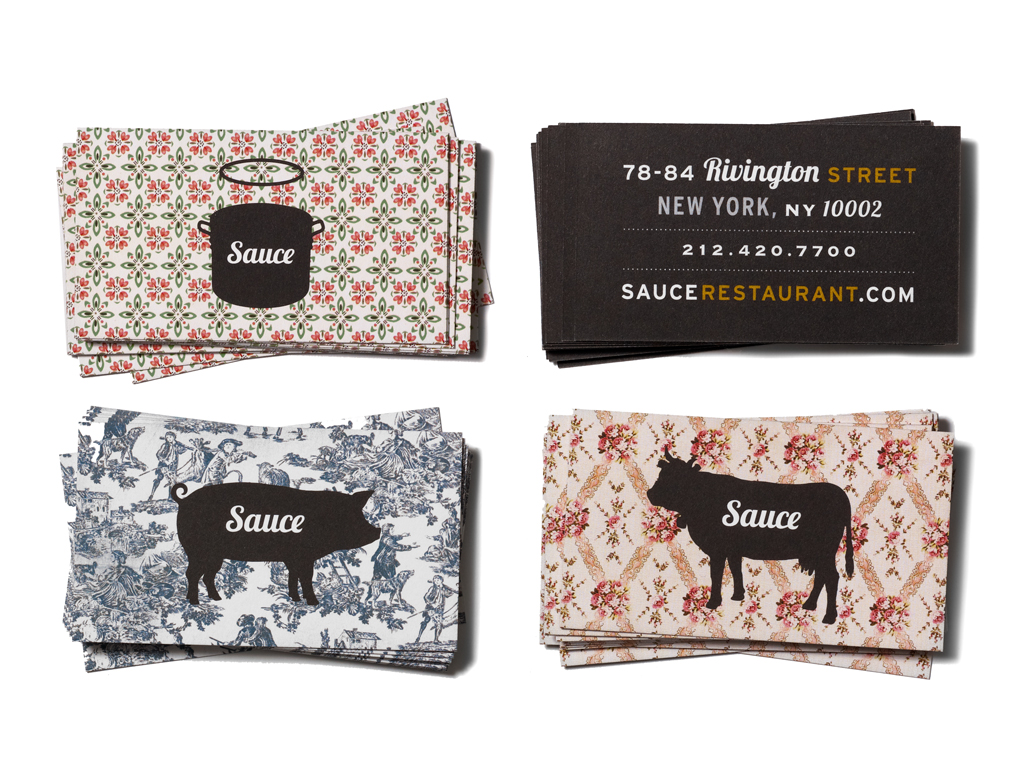
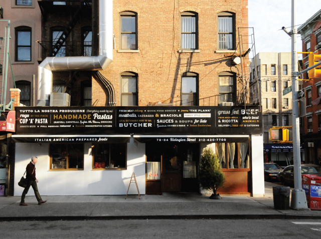
78-84 Rivington Street
New York, NY
212-420-7700