Eye On The Prize: On What It Means To Be Americano
With the James Beard Awards approaching next month, we've been talking with nominees from the Outstanding Graphic Design category to get a below-the-surface look at what inspired and informed their prize-worthy projects. Up next, The Americano, a new hotel-restaurant project in New York City overseen by veteran designer Richard Pandiscio.
Chances are, you've seen the work of Pandiscio's firm Pandiscio Co. without even knowing it. The New York-based studio is responsible for the cool and understated graphics and branding aesthetics for a long list of swanky hotels and restaurants, including Chateau Marmont, The Mark Hotel, the Standard Hotel Group, and The Standard Grill in New York, which earned Pandiscio the James Beard Award for graphic design in 2010.
Housed within West Chelsea's Hôtel Americano, The Americano restaurant is, as Pandiscio points out, as much an extension of the hotel's minimalist design as the neighborhood surrounding it: a study in contrasts, resulting in one cohesive outcome. See below for an interview with Richard Pandiscio.
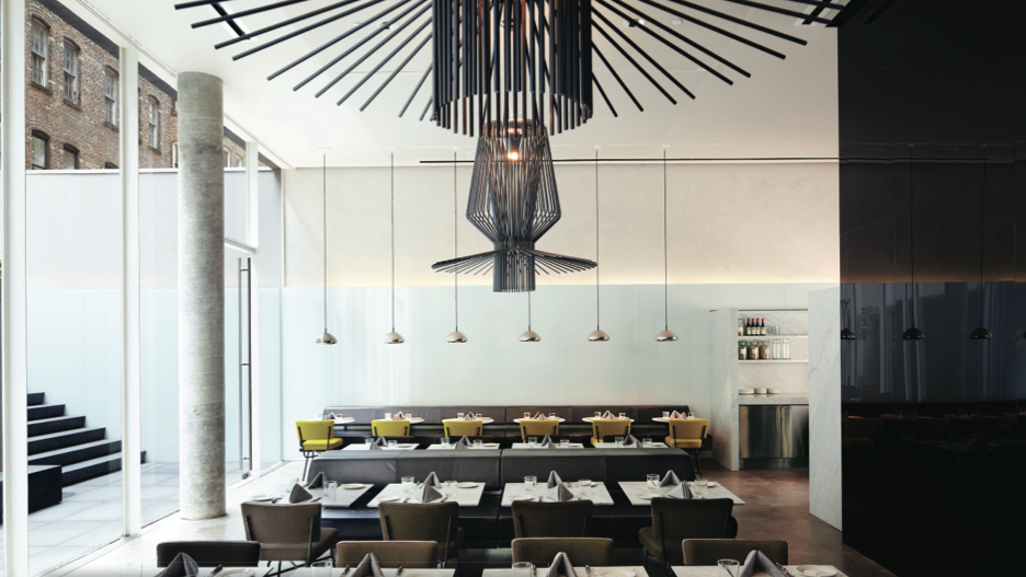
The Americano's modern and spare interior.
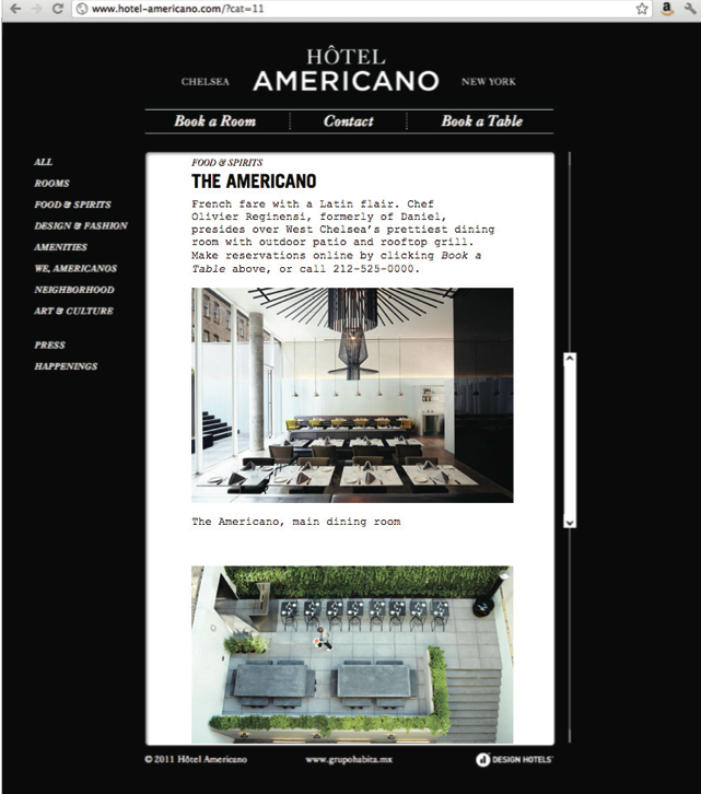
Black and white components, seen here on the hotel and restaurant's website, speak to the harmonious contrasts of the neighborhood, and the general branding of the hotel and its various venues.
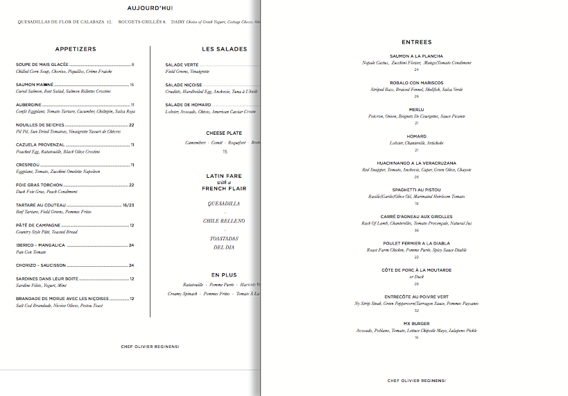
Simple, text-based menus to match.
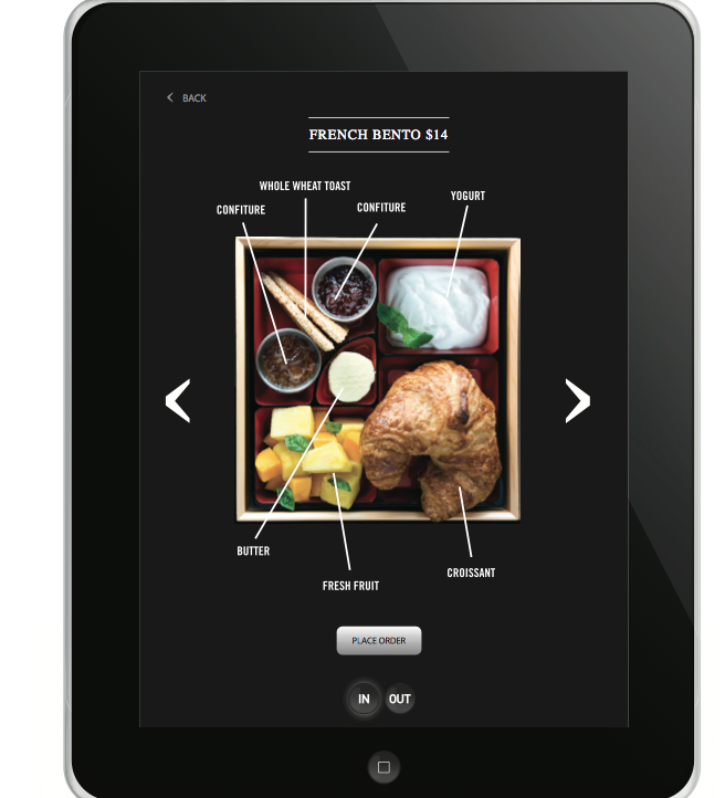
Pandiscio Co. also masterminded an iPad app for the project.
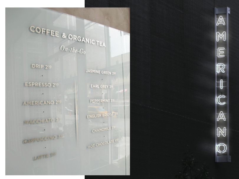
Black and white all over: the hotel's outside facade and a cafe display menu.

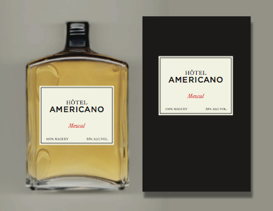
House-branded mescal.
When you're working on any restaurant project, what are the first few questions you ask yourself?
What will make this memorable? What is it about this that can be seen as unique? Why should I care about it at all? Who are the principle players who will have to continue to execute the brand long after I'm gone? How can this brand be created with simplicity in a way that makes the brand easily sustainable, but complex enough to always be surprising?
Tell us about the kind of image you wanted to create with this project.
I'd say the two driving factors in developing the brand were the neighborhood and the ownership. By "ownership," I mean the collective reputation and personalities of the management bringing the hotel to the city. Carlos [Couturier] and Moises [Micha] have built a boutique hotel empire in and around Mexico City. Carlos also has roots in France. Olivier Reginensi, the opening chef, is also French. So those were their flavors, and we wanted to exploit them because they were so genuine. I'd say the toughest conversations I had with them was to convince them to embrace that heritage. At first their desire was to create something very "New York," and I argued that New York was all about blending different cultures and that bringing their particular style of Mexican, Latin, and French culture would be most welcome here. If we have an unofficial tag line for the restaurant it is, "Latin Fare with a French Flair."
This is a restaurant within a hotel. How did that play into the project?
The biggest decision we had to make was whether or not to brand all the elements separately or to unite them. Given the relatively small size of the hotel (54 rooms), the smallish staff, and the limited budget, I thought we would get greater mileage if we united them. In this way advertising, for example, could get more bang for the buck. An ad for "Americano" could promote the vibe and temperament of the whole brand: hotel, restaurant, bar, club, etc., rather than one specific element.
How did the neighborhood affect the branding?
Since most of the owners' clientele are not American we looked at the location both from a visitor's point of view and from a local's perspective. As locals ourselves we know West Chelsea to be very cool, very New York, still gritty, and rather old world. Simultaneously, it is a neighborhood in the throes of becoming a very modern and international district, thanks to the art community which has relocated there.
To the visitor though, particularly a well-heeled one, the neighborhood might seem like they had gotten off at the wrong stop. There's a metal scrap yard across the street, and dozens of warehouses left behind from the time the area flourished as a major depot for the shipping and the railway industries. The Highline, a leftover from that industry, is now drawing thousands of visitors from around the world every day. In all these respects, the neighborhood is very New York: changing, mixing, high and low. All the strange bedfellows that make New York particularly exciting and romantic in a way that other more established areas of the city have lost.
How did you encapsulate this in a single venue, especially a restaurant?
A mixture of fresh local ingredients with international cuisine that is itself a mix of Latin and French, high and low. At the risk of sounding obtuse, to many people, even sophisticated New Yorkers, the idea of Mexican food doesn't go far beyond the taco truck, which, although wonderful, is a small piece of the story.
So contrasting elements are big component.
What would it mean to arrive in New York City and have either a room with a view of the glittering Empire State Building or a room with a view past a small courtyard to a wall covered in an old zigzag of a fire escape—both equally possible at The Americano? It might seem far-fetched, but we took the position that the room with the view of the brick wall and fire escape was just as romantic, just as memorable—both equally beautiful, both equally New York.
How conscious were you about making this project different from the Standard, which is located just down the street?
The projects were similar in that we had done a lot of the branding and graphics for The Standard Hotels over the years, and so were very familiar with the project overall. The biggest difference between The Standard and The Americano, though, was that The Standard Grill was designed to be separate from, but still a part of, the established "Standard" brand, whereas the restaurant, rooftop, club and bar at Hôtel Americano, a fully new brand, are all designed to be part and parcel of the same brand— same messaging, same look and feel.